Randy Hipke
By fusing creative vision, strategic thinking,
and goal-oriented project management,
Randy produces innovative and effective results.


The holiday gift-giving season can be an overwhelming time, especially for grandparents. Selecting the perfect gifts for grandchildren poses numerous challenges, particularly when apparel gifts are involved. It is no surprise that grandparents are renowned for sending clothing gifts to their grandchildren that are comically too big.
When we were approached to create a print ad to promote the Blu-Ray and DVD releases of classic Disney films, we decided to utilize this narrative in a playful way. The advertisement features a child barely visible inside a gigantic sweater, using humor to highlight a phenomenon so universally understood by our target audience. In contrast, it paints the Disney films as gifts that will fit any grandchild perfectly.
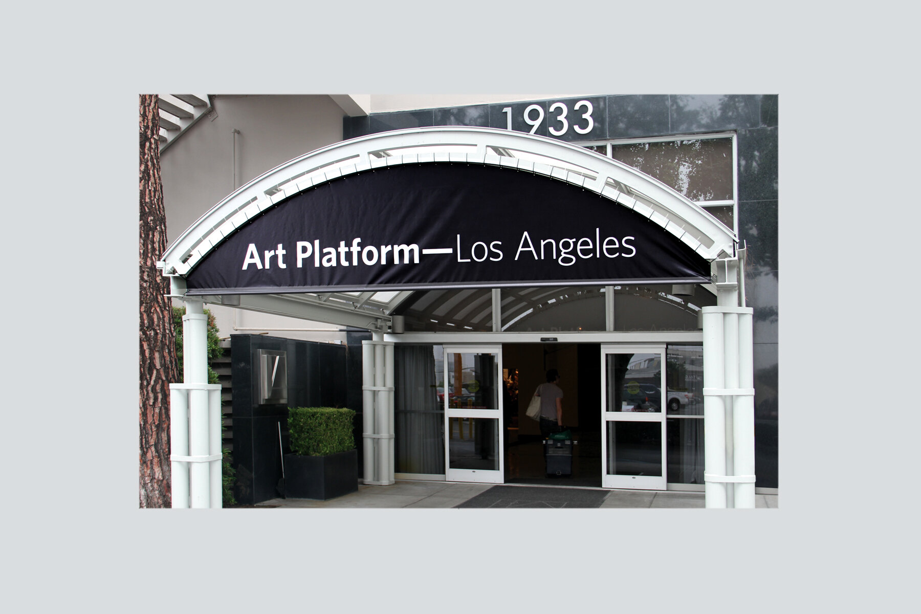
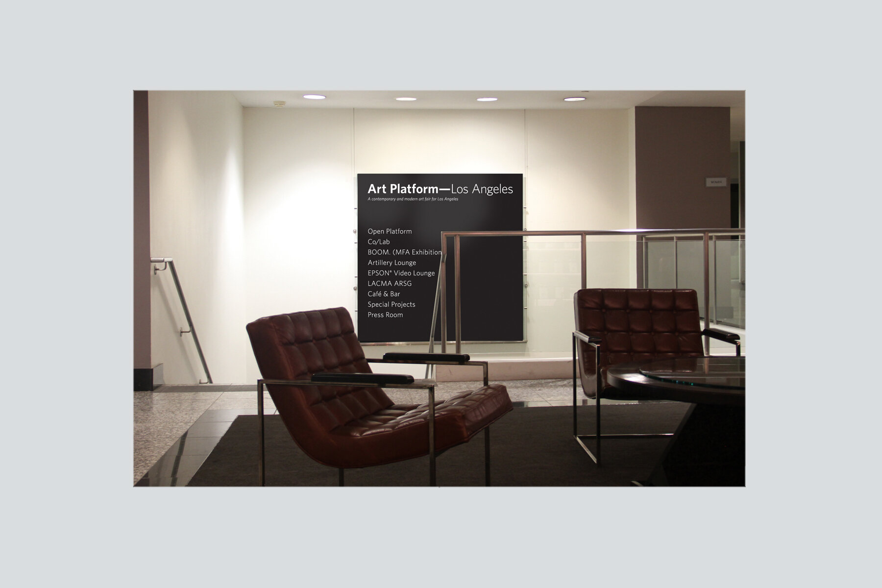
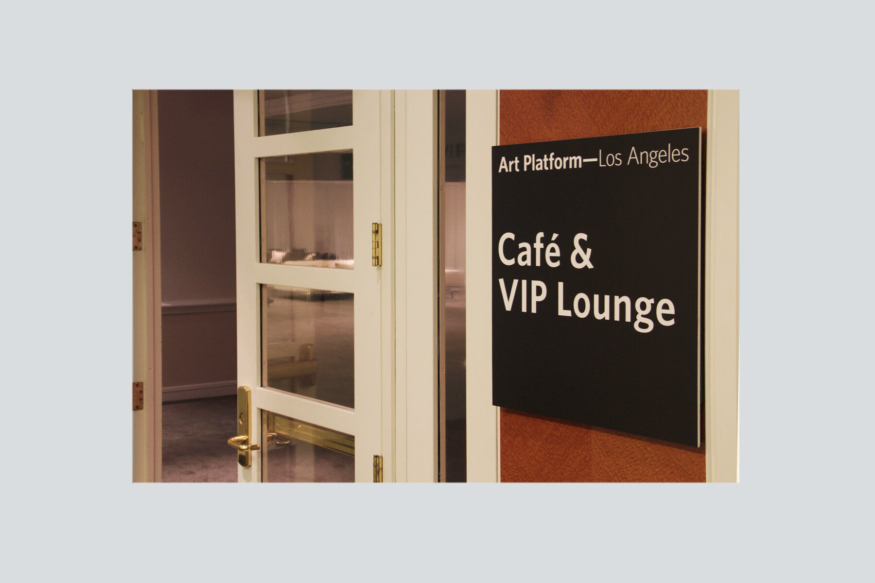
Cast in the same likeness as Art Basel and other international art shows, Art Platform—Los Angeles brought together artists, dealers, collectors, museums, and art enthusiasts for a three-day extravaganza. Because this massive show inhabited several floors of the LA Mart, thoughtful signage and wayfinding systems were essential.
Merchandise Mart Properties hired us to design and manage the production and installation of all of the exterior and interior signage for the event. The project comprised dozens of separate signs and banners for the building exterior, exhibitors, directions, parking, lobbies, elevators and everything in between. The overall design had to be distinctive, elegant, consistent, and above all, highly legible. The resulting signage system allowed visitors to navigate this incredible show effortlessly.
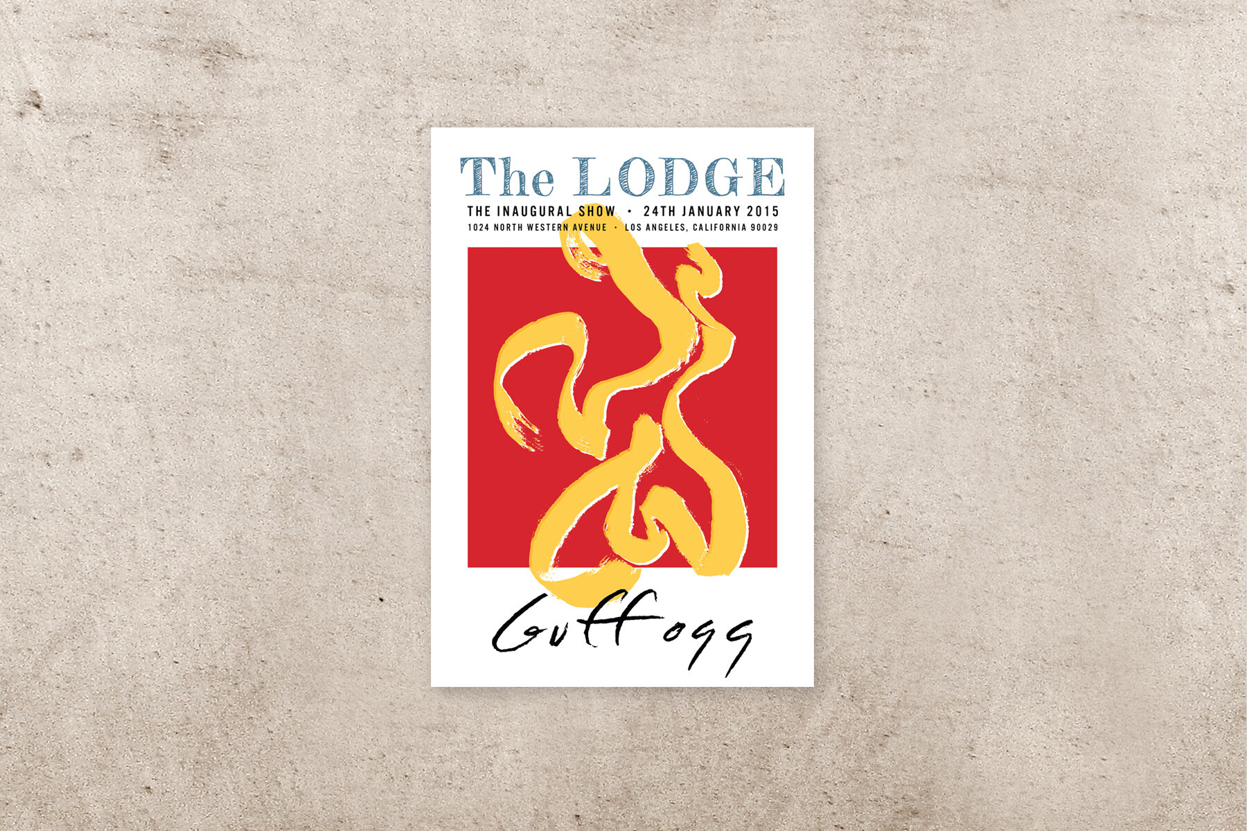
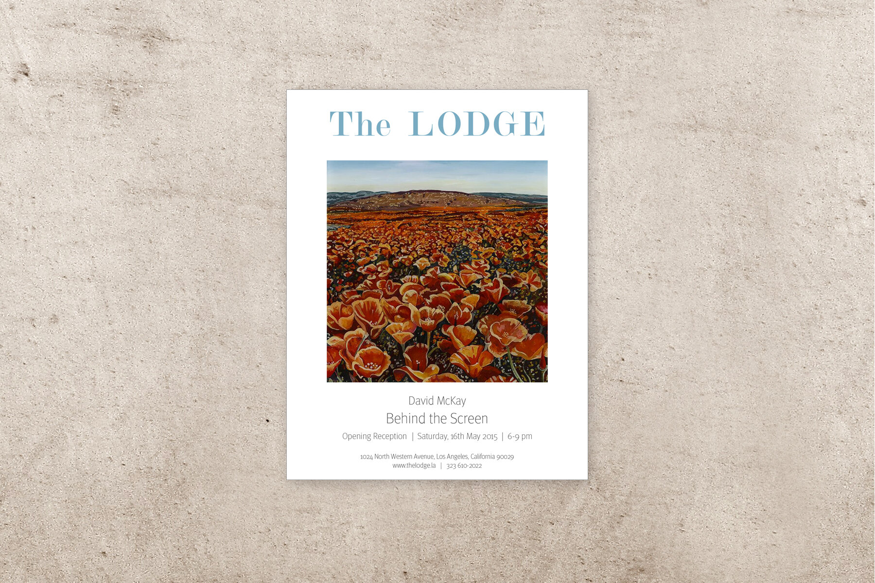
The LODGE is a highly innovative art gallery in east Hollywood. As a new business, it was important for them to develop a unique and recognizable brand that stood out in the crowded Los Angeles gallery scene. The LODGE needed the appearance of an established gallery with the budget of a start-up.
We developed a promotional “shell” for exhibition announcements, allowing each new event to be plugged into an existing design framework. This allowed The LODGE to maintain brand consistency, quickly establishing a signature style, and combine the branding power of a conventional gallery with the fresh perspective of a young gallery.
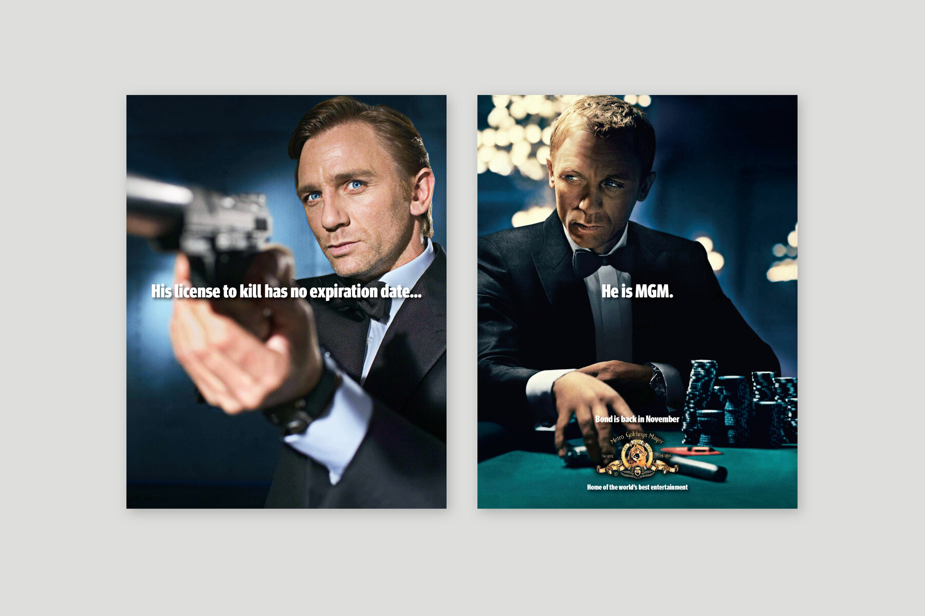
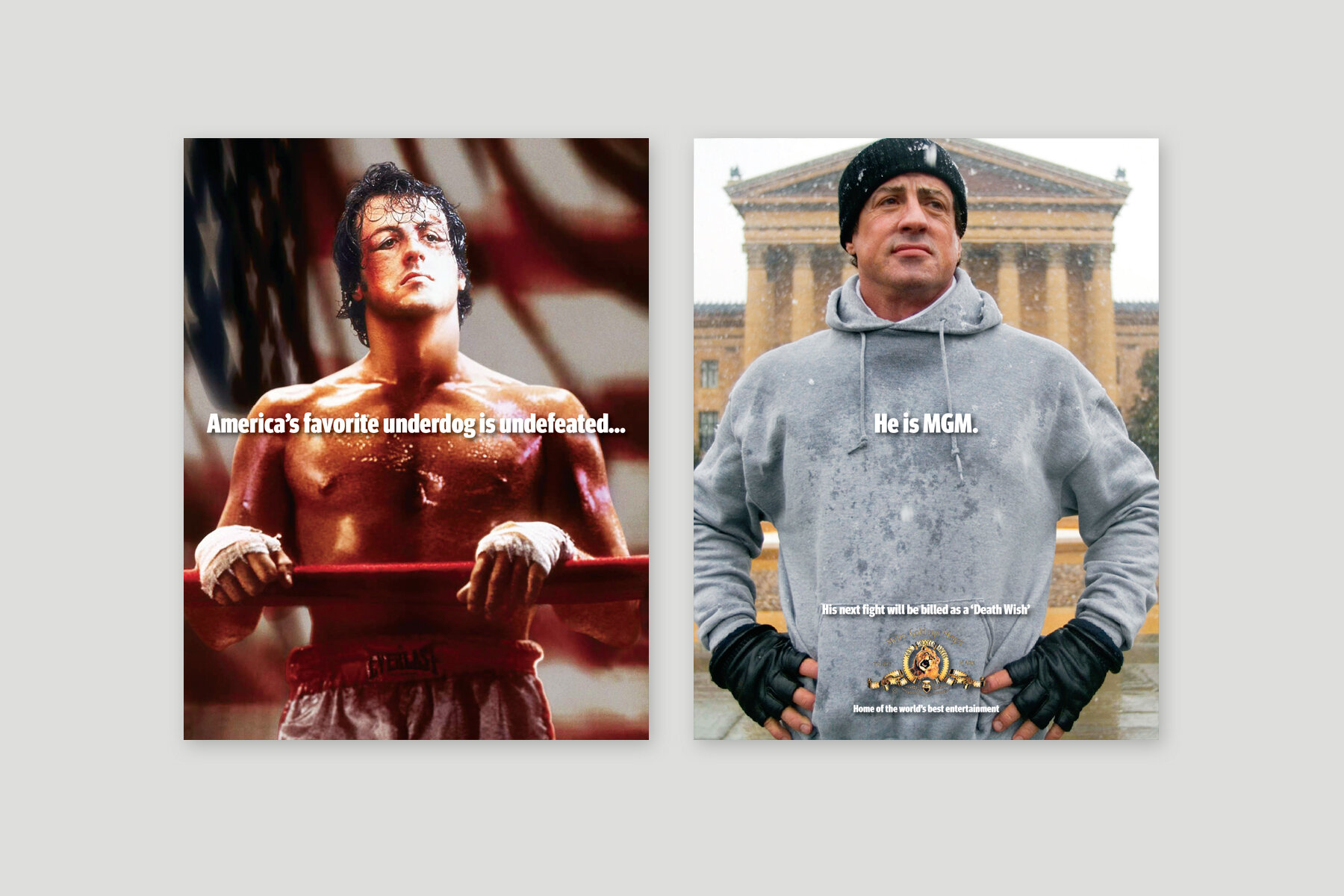
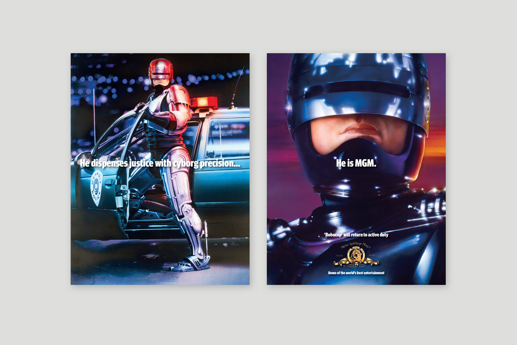
Metro-Goldwyn-Mayer is perhaps the most recognized brand in motion picture history. With a legacy that spans nearly a century, their body of work is both iconic and groundbreaking. Their films have not only been beloved by generations of moviegoers, they have shaped the very landscape of the industry.
MGM hired us to create an advertising campaign to promote their brand by highlighting the numerous blockbuster franchises that call the studio home. It was clear that each of these celebrated works was a reflection of the brand itself, and that the films and studio were inseparable. With this concept, we developed the tagline "He is MGM" to integrate the franchises and the studio into one extraordinary entity.
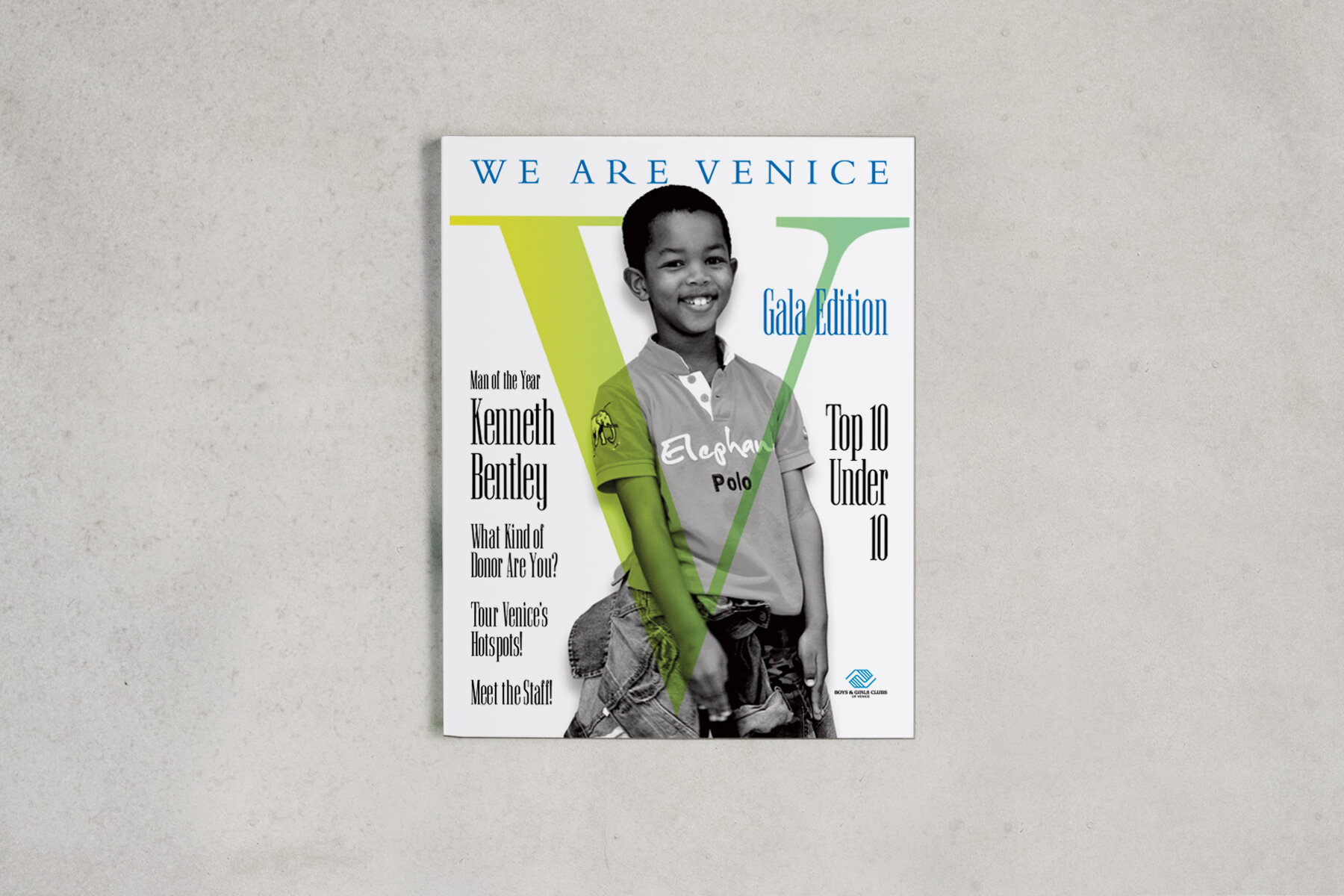
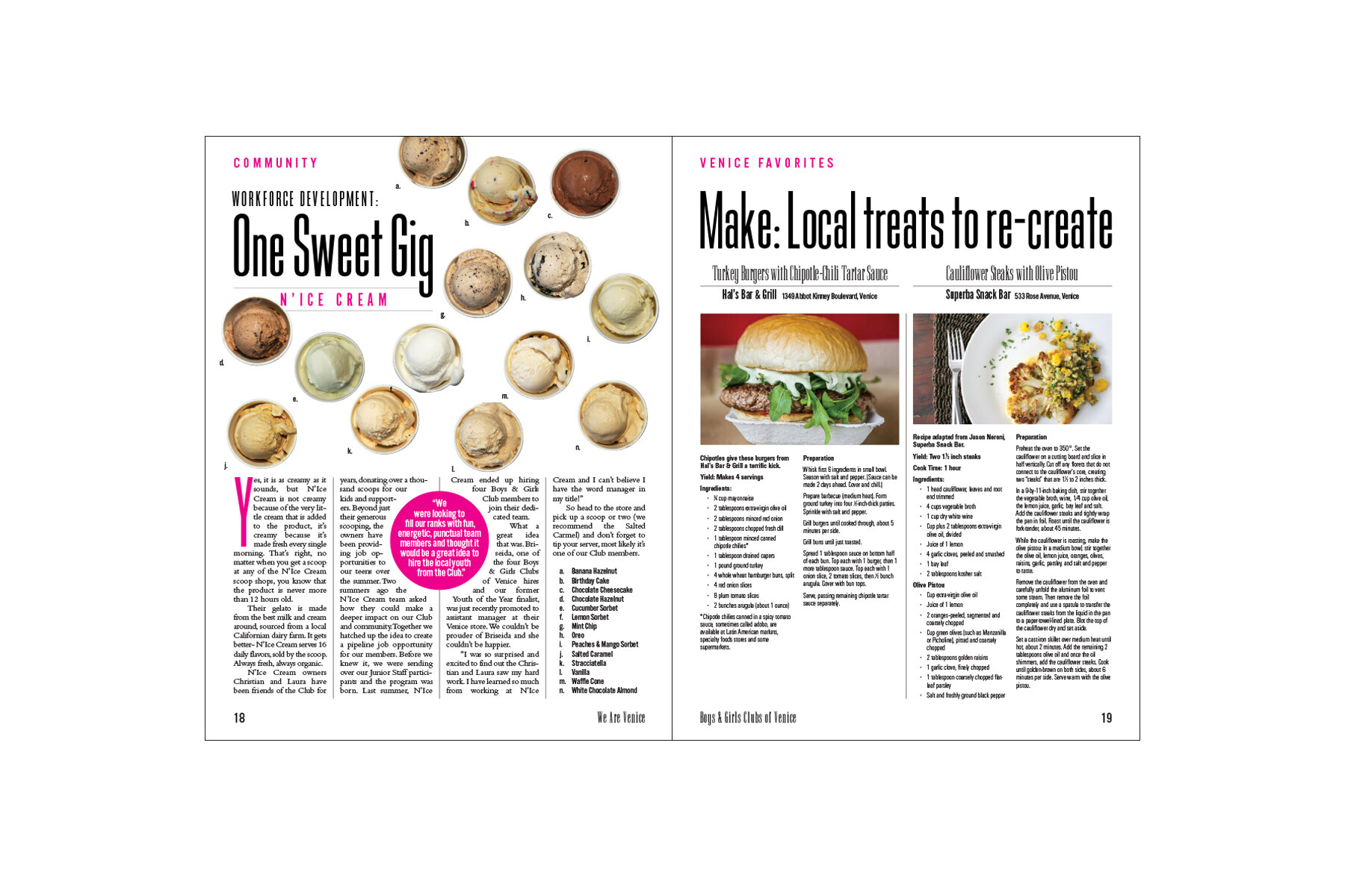
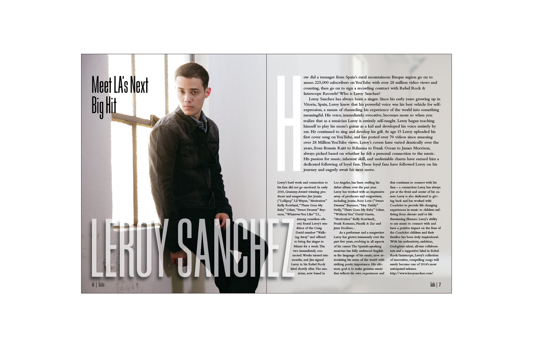
Every autumn, the Boys & Girls Clubs of Venice hosts a large fundraising gala featuring dinner, celebrities, live entertainment, and an auction. Printed programs are distributed to attendees to commemorate the event and communicate with supporters. We were approached to design a printed piece for the club that would serve as both the gala's program and as a year-round promotional tool. The result was a magazine whose contents were free-wheeling, highly-illustrated, fun and informative. It featured staff profiles, recipes, and local attractions. Most importantly, it highlighted the kids whose lives the organization was impacting.
The magazine was an immediate hit. The publications provided support to the organization in a way that worked within their budget, allowing them to focus on the children they serve.
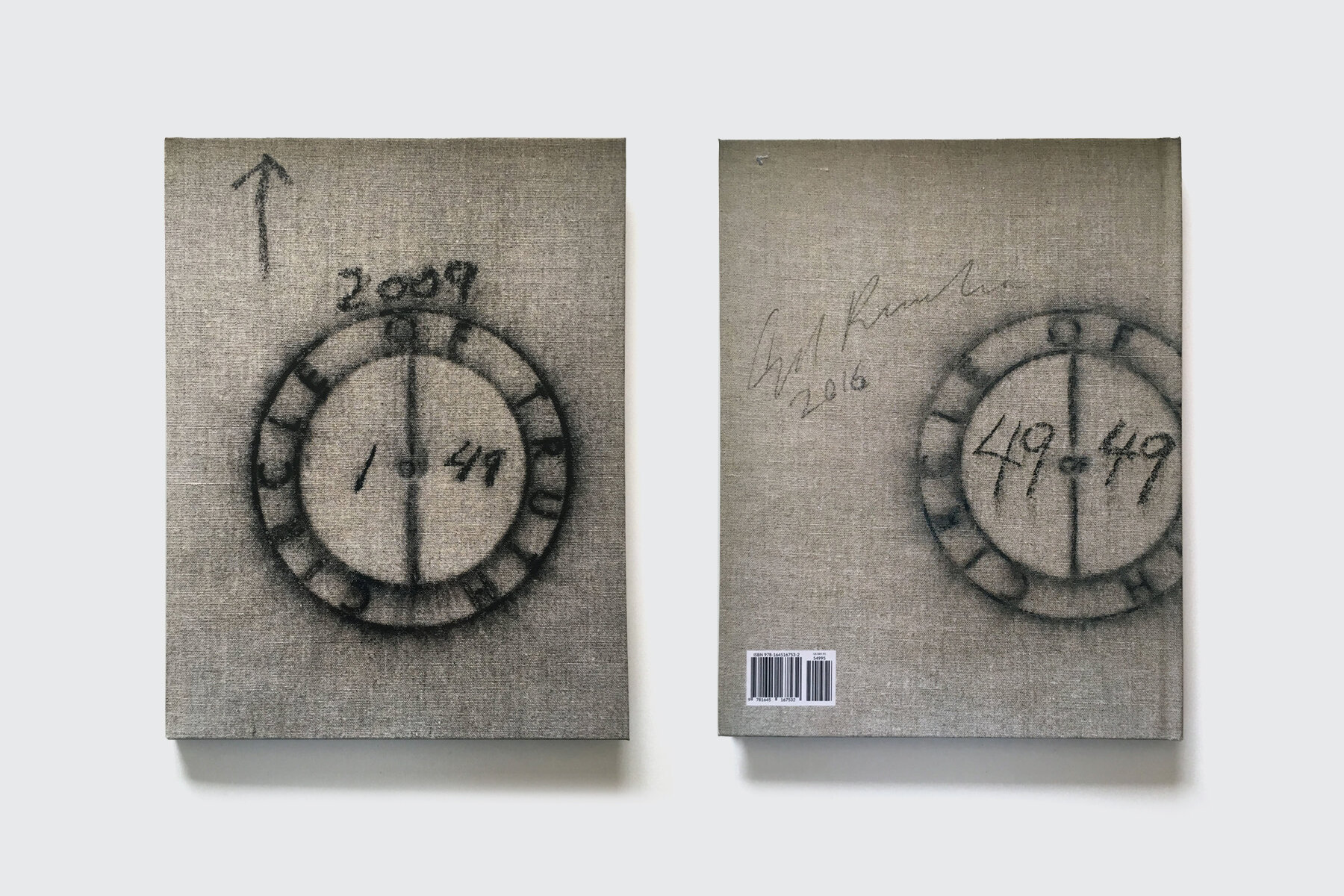
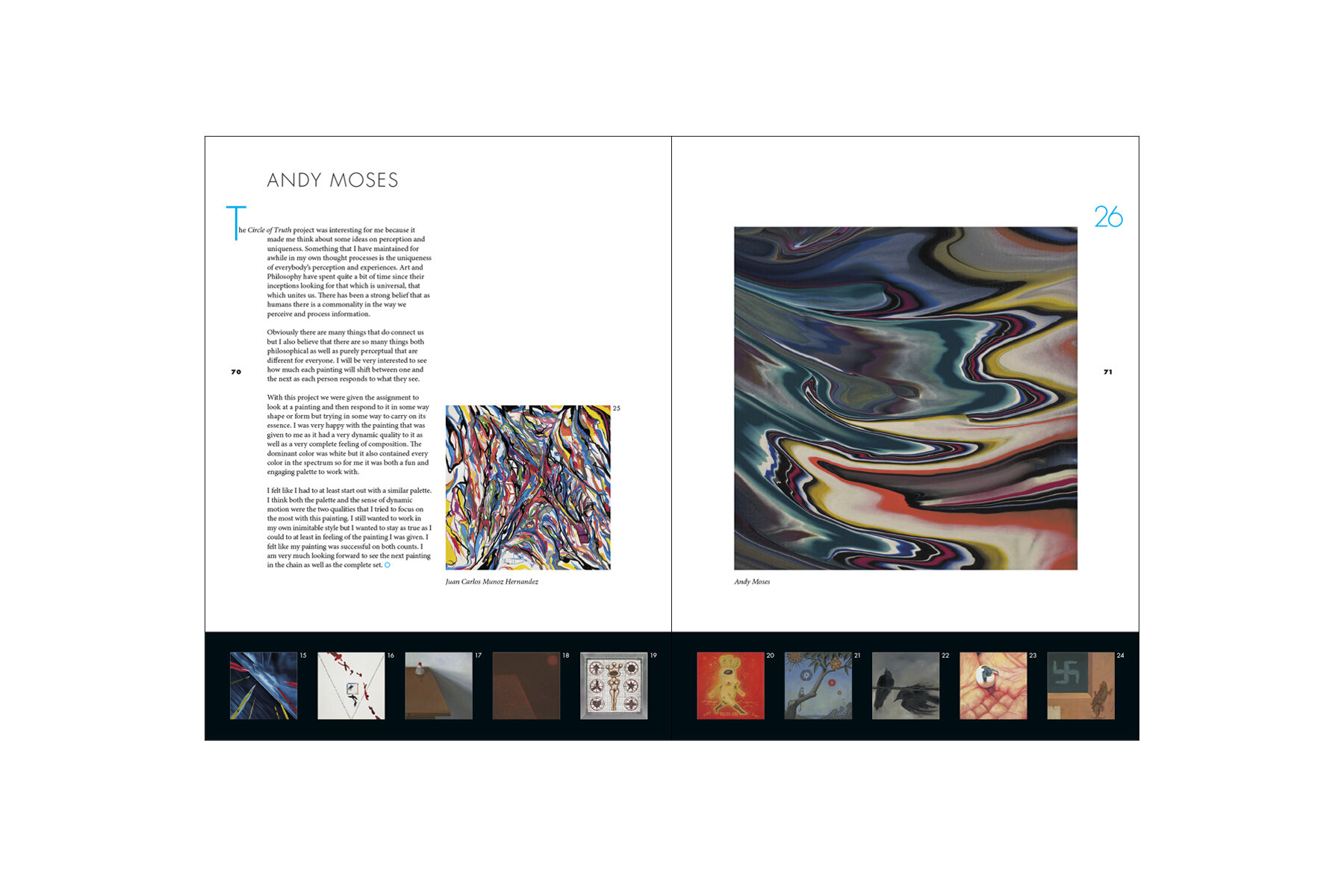
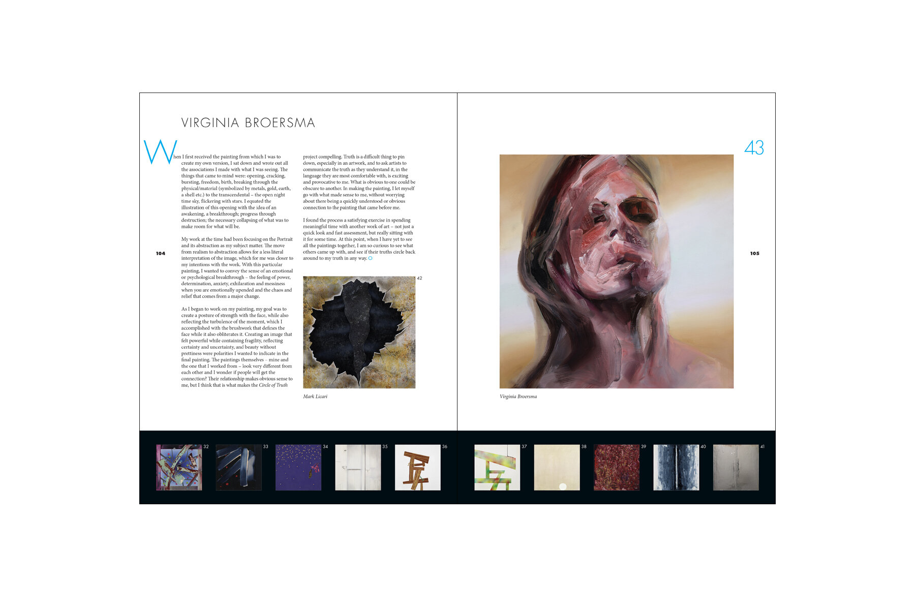
The Circle of Truth is an art exhibition inspired by a childhood game often called "Telephone" or "Rumor Circle". The message, whispered from one child to the next, evolves throughout the activity until it is nearly unrecognizable. The Circle features forty-nine artists attempting a similar experiment through art, with each work being inspired by the work that preceded it.
Those who viewed the exhibition in person would be able to see the works sequentially. However, developing an exhibition catalog that captured the nuances of this experience posed numerous challenges. Spreads were designed for each artist, featuring that artist’s work juxtaposed with the previous piece. The “crawl” in the black band was created to allow the reader to understanding how each work evolved from the sequence of previous works without leaving the spread.
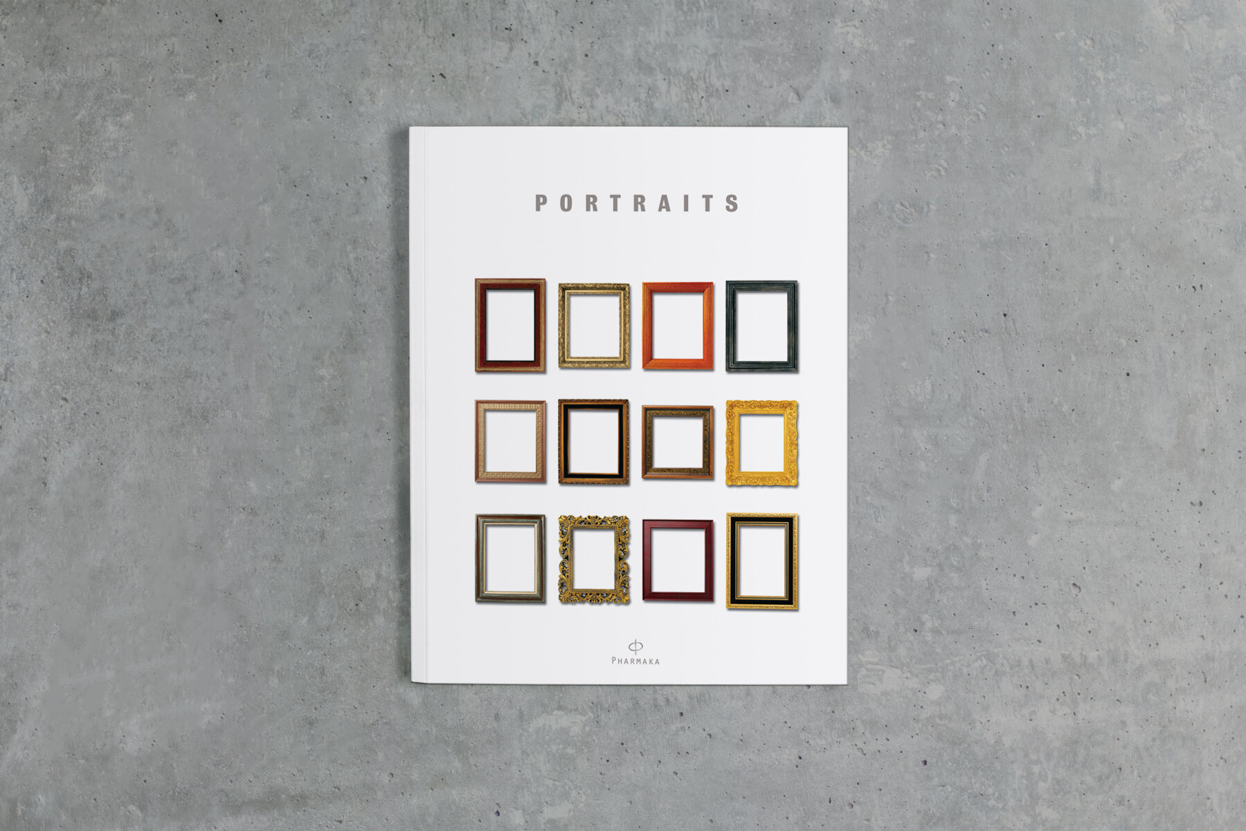
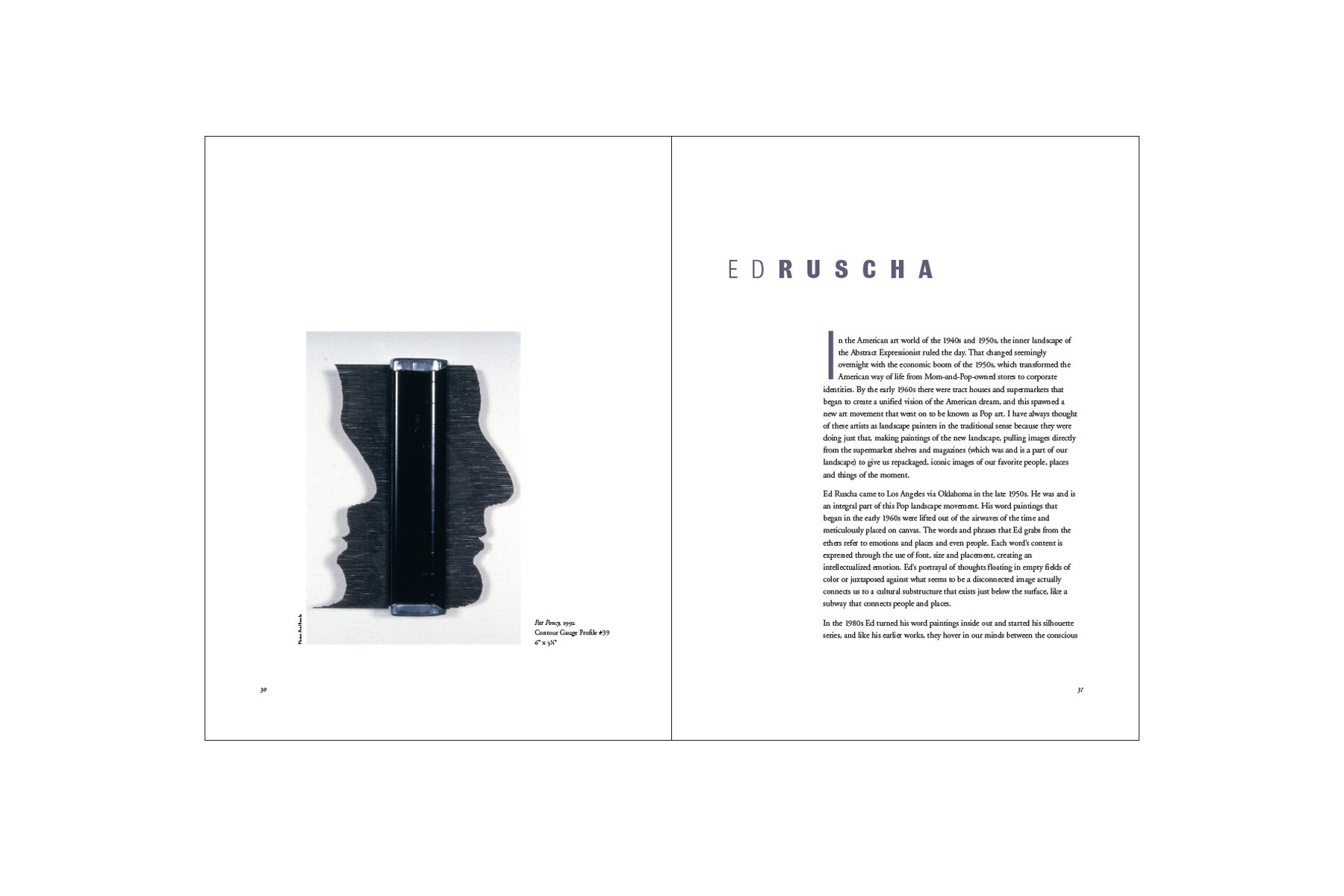
Pharmaka was an influential conceptual fusion of gallery and museum located on the corner of 5th and Main in downtown Los Angeles. They anchored monthly evening artwalks, bringing a new energy to the area and establishing it as an art destination. Exhibitions were highly innovative, often experimental, and expertly curated.
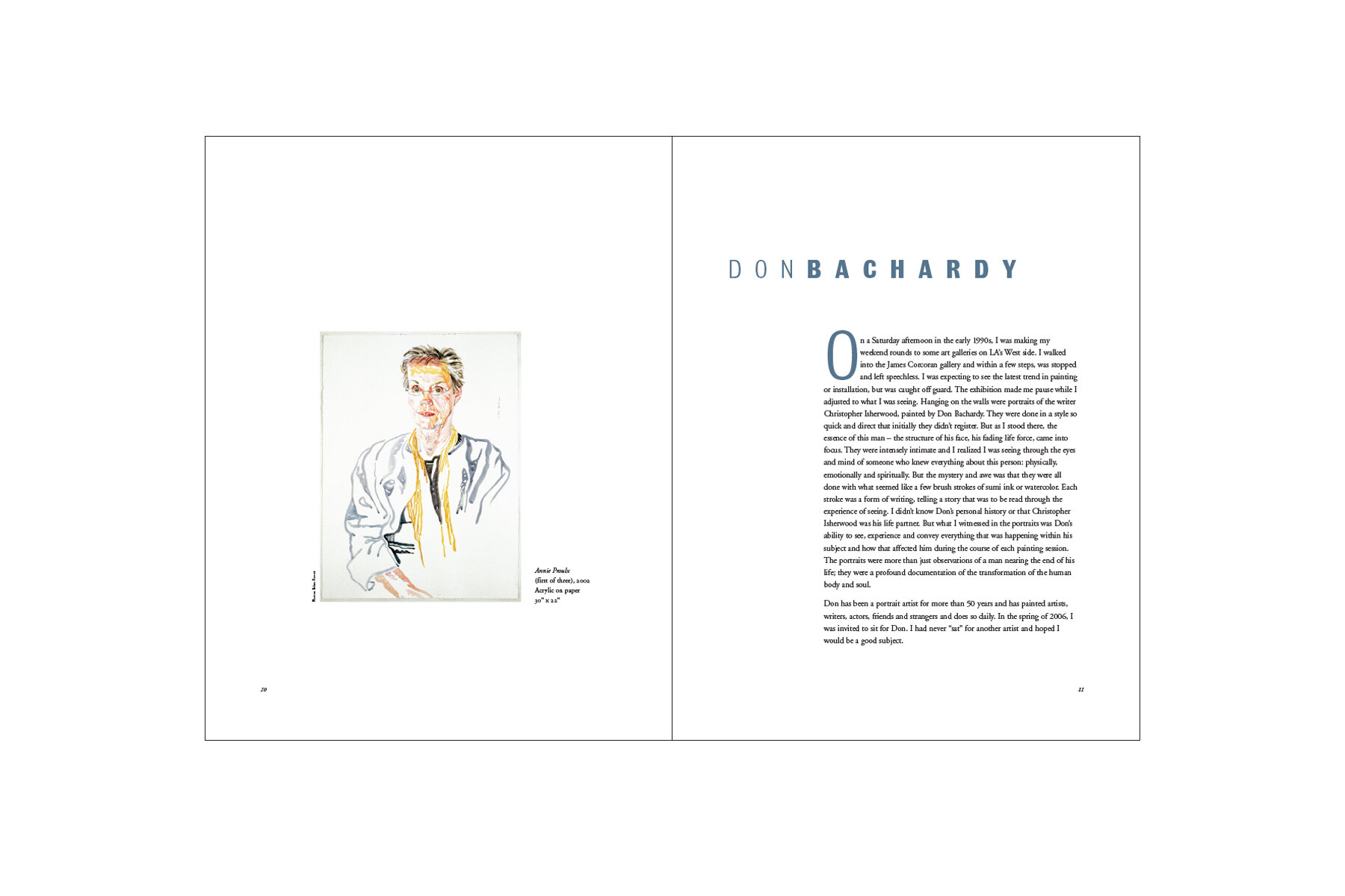
We designed numerous catalogs and promotional materials for Pharmaka, including the catalog for Portraits, an exhibition examining the concept of portraiture and featuring artists such as Ed Ruscha and Don Bachardy. The show challenged the traditional definition of a portrait, proving that nearly anything could be a portrait. To honor this concept, we did not feature any particular artwork on the cover, instead using empty frames to set up the work contained inside. In a way, the metaphorical cover became a portrait of the show itself.
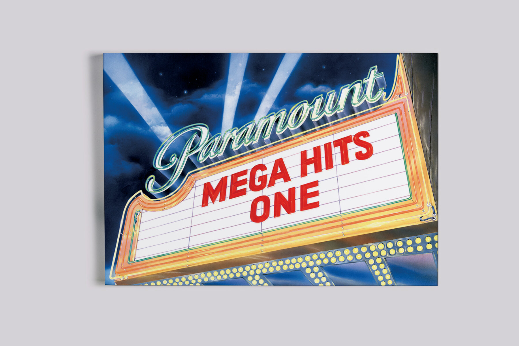
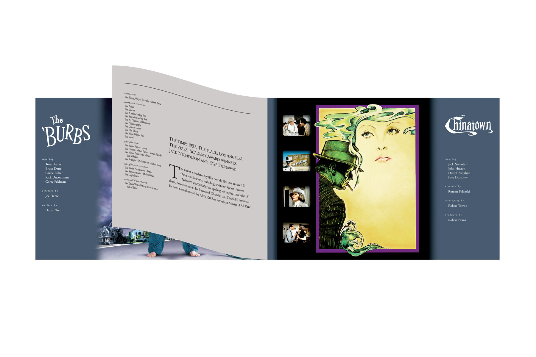
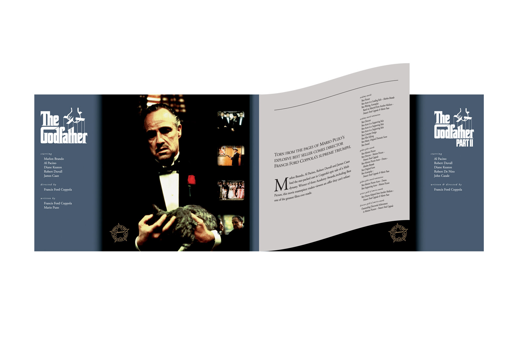
Founded in 1912, Paramount is one of the world's first motion pictures studios. Their legacy predates many of their contemporary competitors, yet they remain at the forefront of entertainment. Their work has left a lasting impact on audiences around the world.
We were approached by Paramount with the task of re-marketing their prestigious library of classic films for television. Since each of these films have a wealth of sentimental value for audiences, we approached the task by highlighting the strengths and successes of each. For this brochure, we designed and commissioned a dramatic illustration of a theatre marquee, evoking a nostalgic and timeless Hollywood scene. Inside, “short sheets” featured Academy Awards, copy, and credits that juxtaposed each film’s famous key art. The result was a brochure that underscored the significance of each film.

Absolute Balance was founded upon the concept that an athlete's physical performance is directly linked to their body's equilibrium. By analyzing and optimizing a body's movement between balance points, this company's goal is to improve the accuracy and capability of athletes. Their work encompasses a wide variety of sports, from baseball to golf, with the potential to expand beyond athletics.
The identity for Absolute Balance needed to quickly convey the company's concept without depicting a specific sport or type of athlete. In essence, it needed to depict a highly specialized concept in a very broad sense. The solution features a cube, both as a metaphor for precision and as a deliberate departure from sports-centric imagery. Tantalizingly perched on a single point, the shape effectively connotes absolute perfection of balance.
The Circle of Truth is an art exhibition inspired by the childhood game in which a message, conveyed from individual to individual, naturally evolves from the beginning of the game to the end. The result is a sequence of works that allows viewers to explore how truth filters through the perspectives of others.
The curators needed a brand identity as a visual representation of the exhibition's premise. They were in the process of attracting participants and sponsors, so the logo needed to be meaningful, elegant, and persuasive. We created a mark that accomplished these tasks, capturing the spirit of the exhibition and the attention of artists and backers. The Circle of Truth was able to garner the support it sought, and the completed exhibition is currently traveling to museums across the United States and Europe.


Located in Pasadena, California, the Rose Bowl Aquatics Center is home to nationally renowned swim, dive and water polo teams. As a non-profit organization, they rely on donations and fundraising to support these activities. We were tasked with creating a mark for the Girls Water Polo teams that would highlight their program and translate well to merchandise.
We saw this as an opportunity to convey the physicality of the sport and foster an emotional connection with potential patrons. Working with an illustrator, we created this mark featuring a player in action, celebrating the energy of the game. We managed the production of their promotional merchandise, which sold well and gave the Girls Water Polo teams the fundraising support they needed.
Australian Terriers are small, delightful dogs with a passionate owner group. Once a year they congregate somewhere in the United States to celebrate their unique breed. The 76th Specialty, or convention, was booked on the famous Queen Mary luxury liner, permanently moored in Long Beach, California.
We were excited to take on the task of creating a mark to commemorate this special event. The nautical theme, so integral to that year's gathering, provided us with the opportunity to be playful. The mark, with its stylized dog, life preserver, and maritime color palette, captured the character of both the event and the organization. The mark was applied to collateral materials, event signage and merchandise, conveying as much energy as the dogs themselves.

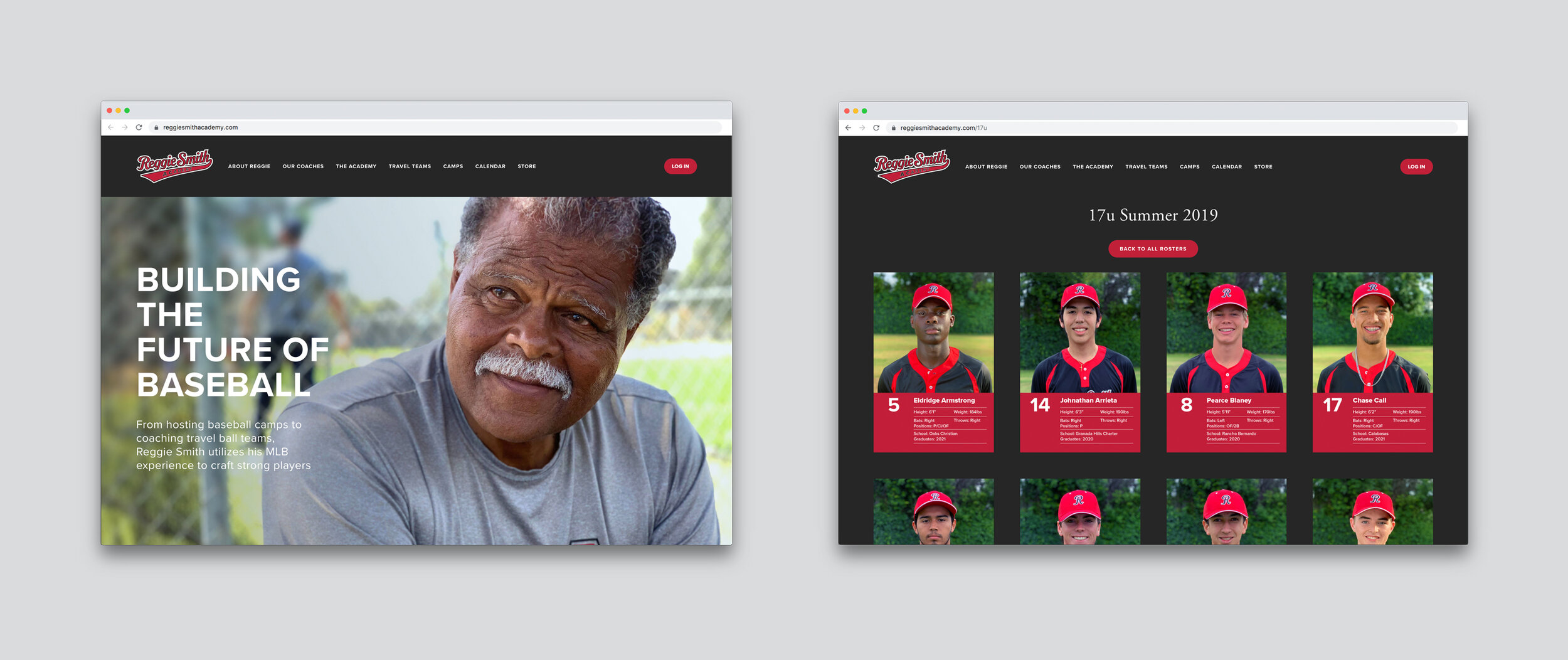
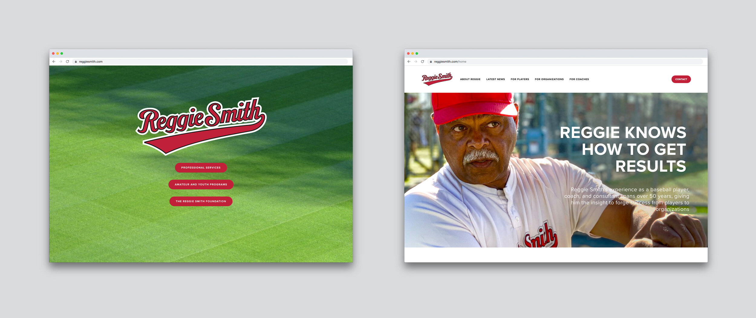
The game of baseball has always been a great love of ours. We first met former Major League Baseball player Reggie Smith at a fantasy baseball camp at Dodgertown in Vero Beach, Florida. Reggie's career in Major League Baseball is robust, having played for the Boston Red Sox, St. Louis Cardinals, Los Angeles Dodgers, and San Francisco Giants. His extensive experience lead him to become a hitting instructor and first base coach for the Dodgers, as well as a coach for Team USA.
Reggie's passion for teaching inspired him to start Reggie Smith Baseball Centers, an organization dedicated to creating baseball programs for youth and amateur players. We collaborated with Reggie to develop a branding and marketing approach that embodied the spirit of baseball.
As his business continued to expand and evolve, our partnership became more extensive. The scope of our work grew to include advertisements, merchandise, uniforms, printed collateral, and digital content.
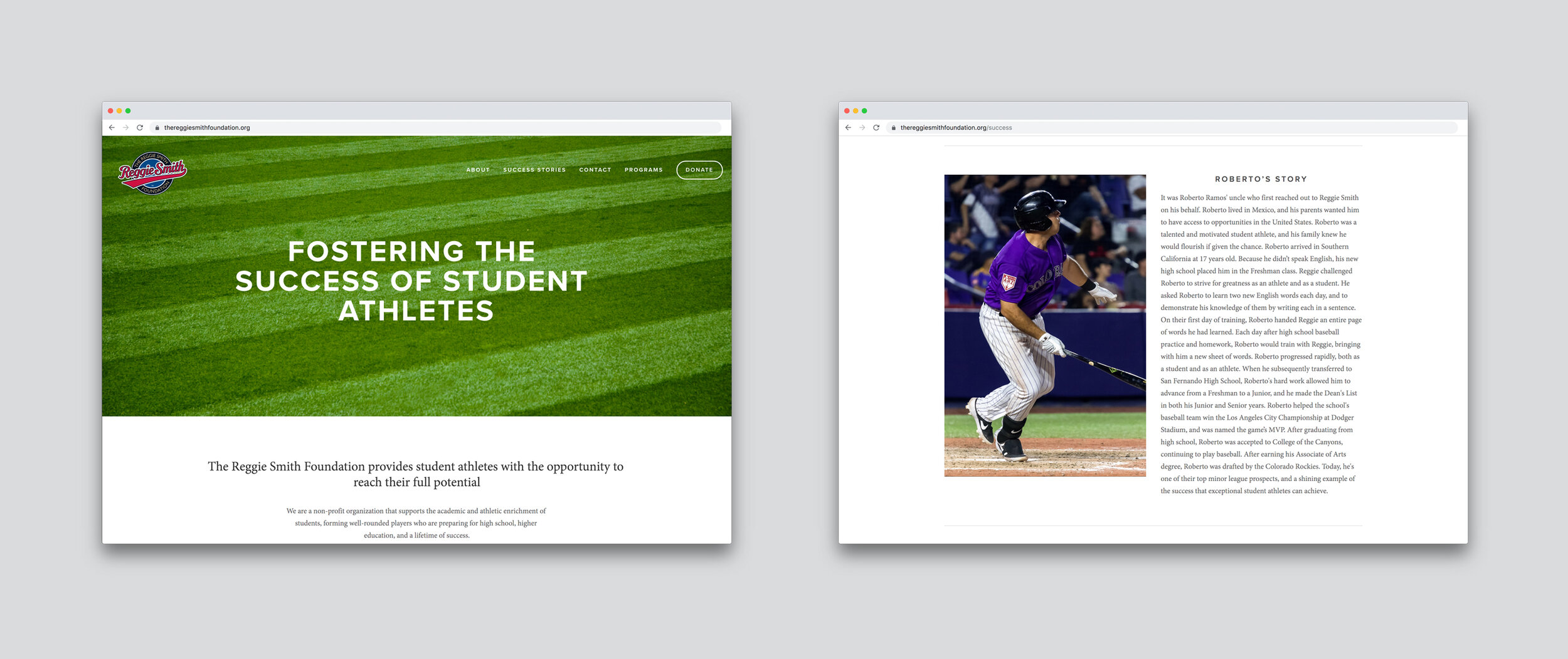
In 2017, Reggie created The Reggie Smith Foundation, a non-profit organization focused on providing scholarships to deserving student athletes. Our collaboration broadened further to support The Foundation's unique communication and fundraising needs, including the development of a donor-focused website, email newsletter, fundraising materials, and specialized donor communication. We also provide ongoing support for his business ventures through email marketing and social media management.
Reggie utilizes his skills and love of baseball to create lasting impact on the lives of others by empowering them to achieve their athletic and academic goals. Our collaboration provides Reggie with the support he needs to achieve his goals.
The Noah Purifoy Foundation was established in 1999 to preserve and maintain the late artist’s impressive outdoor assemblage sculptural museum in Joshua Tree, California. The all-volunteer, non-profit group must constantly solicit contributions to stay ahead of the effects of the sun, extremes in temperature and time to which Purifoy’s works are subject.
When we were commissioned to design an informational pamphlet we looked beyond the ubiquitous letter-sized, trifold brochure that may have been expected. Something that folds to become highly vertical didn’t make visual sense given the 10-acre horizontal expanse over which this museum is stretched. Horizontal was the key word as sand and scrub sweep out to meet the sky. Nothing is vertical here. Wanting to use as many of the client-supplied photos as possible, we chose a format 14" wide by 8 1⁄2" high, folding in half to 7"x 8 1⁄2." This allowed for wider text columns and generous white space – room to breathe.
When the comprehensive was presented, we explained our horizontal rationale and the board members agreed. The initial printing was 1,000 brochures. Not long after, they ordered 2,500 more, saying that donations had increased by hundreds of dollars a month, and that they attributed the change to the effects of the brochure. In design there aren’t many projects whose impact can be accurately assessed – or determined in such a short time. This brochure was one of the rare exceptions.
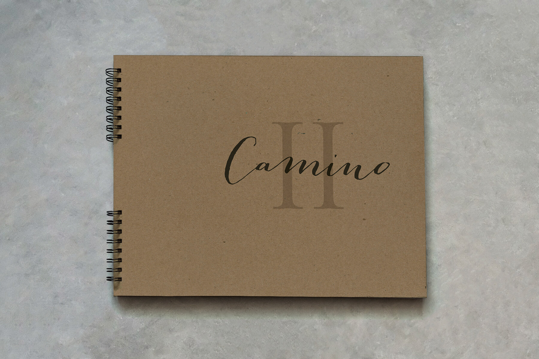
Michael Fish is a South African priest and public speaker whose path has led him from training Zulu novice priests in the wilds of Africa to the natural beauty of the New Camaldoli Hermitage in Big Sur, California. He is self-supporting, hosting spiritual retreats across the country and around the world. His themed retreats combine his unique, though-provoking perspective with amusing, often self-effacing stories. He ties the entire experience together by providing attendees with carefully curated supporting materials, including poetry, scripture, and photographs.
We met Michael after a multi-day retreat in Santa Barbara, California. At the time, the supporting materials he was distributing took the form of humble office folders filled with photocopies. We proposed a solution that would not only elevate logistical challenges, but provide attendees with the materials in an uncomplicated and beautiful way.
We created numerous sets of spiral-bound journals, each corresponding to one of his themed retreats. The understated chipboard covers are screen printed by hand, reflecting the contemplative materials within. With generous margins and additional blank pages, attendees are encouraged to write annotations and reflections. The journals changed how people experienced the retreats and how they extended that experience into their lives afterward.
While Michael’s retreats are popular, being dependent solely on personal appearances was limiting his income potential. To address this, we started recording and marketing Michael’s live retreats as multi-disc CD sets and digital downloads. Thirteen of his recordings are now sold online and at retreat venues, greatly increasing his annual revenue.
We collaborated with Michael in early 2018 to create a monthly email newsletter to increase awareness of Michael’s ministry and engage with his supporters. What started as a list of 125 recipients rapidly expanded into a thriving audience, with roughly 1,300 current subscribers.
As Michael's popularity continues to grow, the potential for new opportunities grows exponentially. By identifying ways to maximize his offerings, we've helped Michael financially support himself as he shares his extraordinary vision with others.